
Showcase Builder
The Showcase Builder is a single-page, live-preview editor: every tab you configure updates the preview panel on the right immediately, and nothing is saved to the site until you click Update.
Open it from Logo Slider → Showcases → Create Showcase, or by editing an existing showcase.
The builder layout
Every tab shares the same three-part layout:
- Top bar — Change Source (which logo library to draw from) and Change Layout (Carousel / Grid / Flexbox) on the left; Copy Shortcode and Update on the right. Usage, Demo, Support, and Get Pro! links sit above them.
- Left sidebar — the six tabs covered below, plus an "Unlock More Features" card promoting Pro.
- Center panel — the settings for whichever tab/sub-section is selected.
- Right panel — the live preview, with desktop/tablet/mobile view toggles, Focus Mode, and Refresh Preview.
A 🔒 next to any field below means it's Pro-only. See Free vs Pro for the full breakdown, and Settings Reference for every field in one table.
Content tab
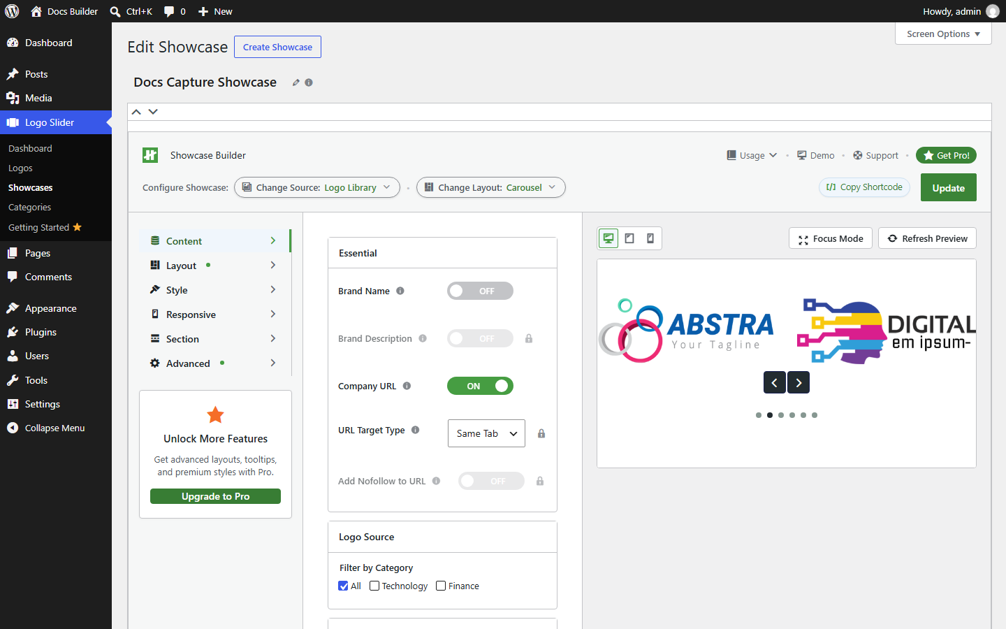
Legend
- Essential — Brand Name (Free, off by default), Brand Description 🔒 (Pro), Company URL (Free, on by default), URL Target Type 🔒 (Pro), Add Nofollow to URL 🔒 (Pro).
- Logo Source → Filter by Category — Free. Check All, or specific categories, to control which logos this showcase includes. See Categories.
Layout tab
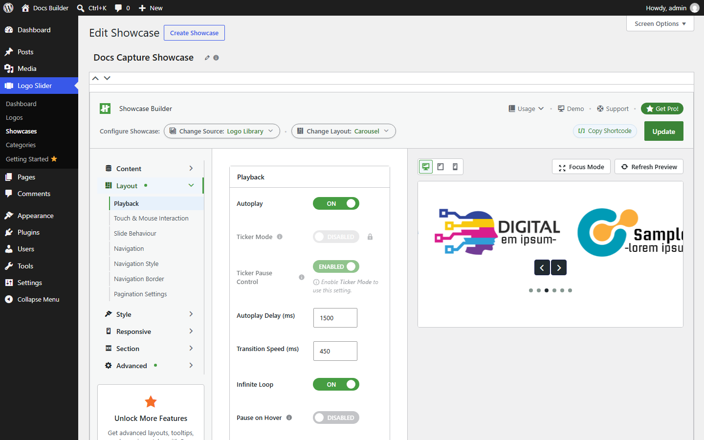
The Layout tab has its own sub-navigation: Playback, Touch & Mouse Interaction, Slide Behaviour, Navigation, Navigation Style, Navigation Border, Pagination Settings. The screenshot shows Playback:
Legend
- Autoplay — Free, on/off.
- Ticker Mode 🔒 — Pro. Continuous non-stop scroll instead of discrete slides.
- Ticker Pause Control — Free, but only takes effect once Ticker Mode is on (the UI greys it out and says so otherwise). A WCAG 2.2.2 pause/resume control for Ticker Mode.
- Autoplay Delay (ms) and Transition Speed (ms) — Free, numeric.
- Infinite Loop — Free, on/off.
- Pause on Hover — Free, on/off (shown further down the panel).
The other Layout sub-sections (not separately screenshotted) map to these capabilities: Touch & Mouse Interaction → touch swipe (Free) and mouse wheel/grab cursor (Pro); Slide Behaviour → standard transition (Free) and Coverflow 3D (Pro); Navigation → basic arrows (Free) and advanced arrow options (Pro); Navigation Style → arrow/pagination colors (Free, with the B104 caveat below); Navigation Border → border on/off/color/width/style (Free) and border radius (Pro); Pagination Settings → basic dots (Free) and advanced/dynamic bullets (Pro). See Settings Reference for the exact field list.
Known caveat (B104): three hover-color fields (nav color hover, nav background color hover, nav border color hover) are Free in the registry but their only CSS renderer is currently Pro-gated at file level — a Free user can set them and see no visible effect. Logged in the capability map, not yet fixed. Don't rely on those three specifically working in Free until that's resolved.
Style tab
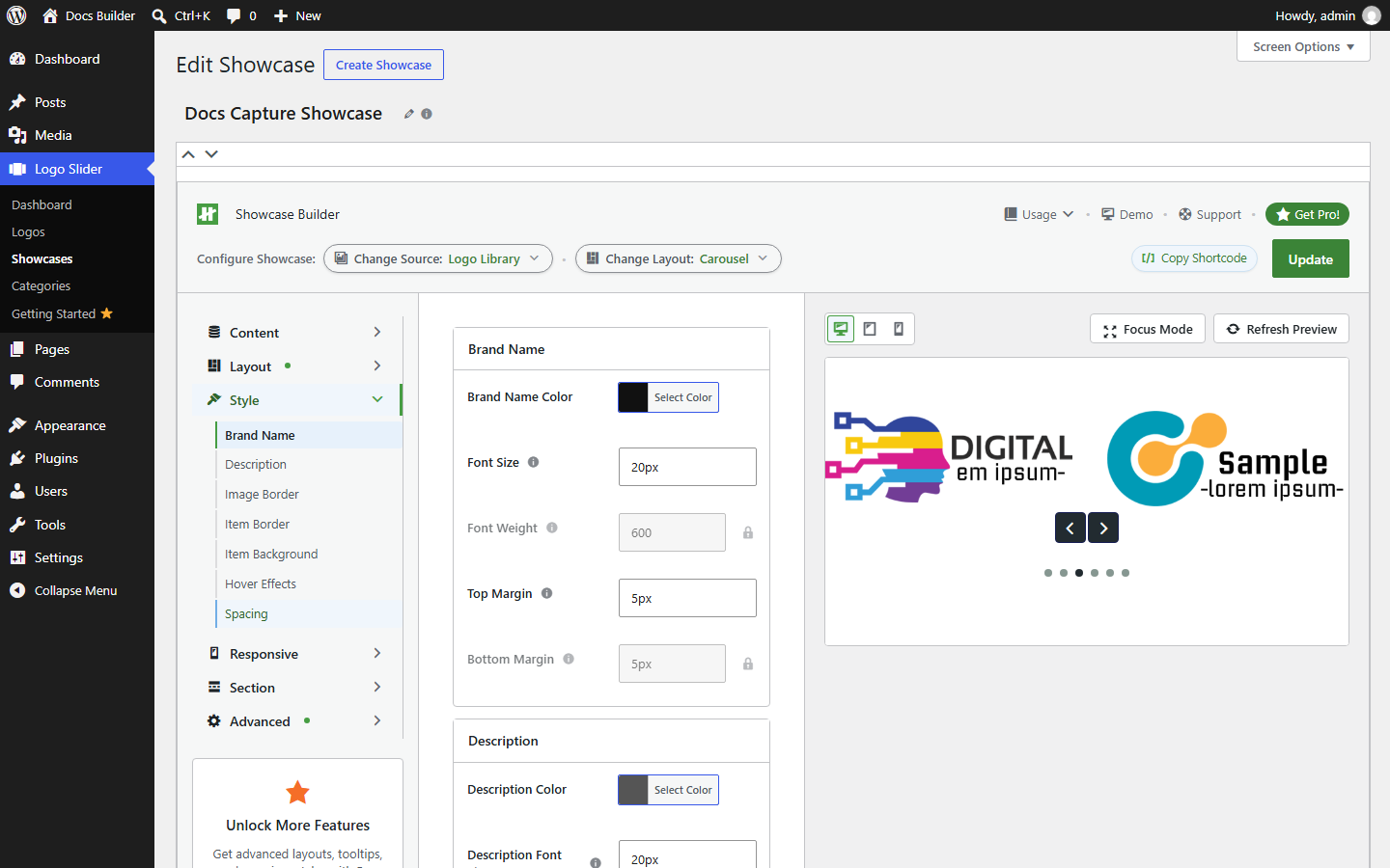
Sub-navigation: Brand Name, Description, Image Border, Item Border, Item Background, Hover Effects, Spacing. Shown: Brand Name.
Legend
- Brand Name Color and Font Size — Free.
- Font Weight 🔒 — Pro.
- Top Margin — Free.
- Bottom Margin 🔒 — Pro.
The same Free-basics / Pro-refinements split repeats for Description. Image Border is fully Free. Item Border and Item Background are fully Pro. Hover Effects is Free only for "none" (any actual animation is Pro). Spacing (padding/margin) is Free. See Settings Reference for the exact field list.
Responsive tab
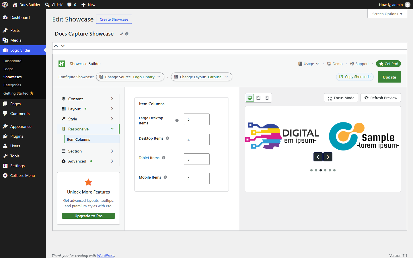
Legend
- Item Columns — one number field per breakpoint: Large Desktop Items, Desktop Items, Tablet Items, Mobile Items. All four are Free.
This is the entire Responsive tab — a single "Item Columns" panel, which is why it's a subsection here rather than its own documentation page.
Section tab
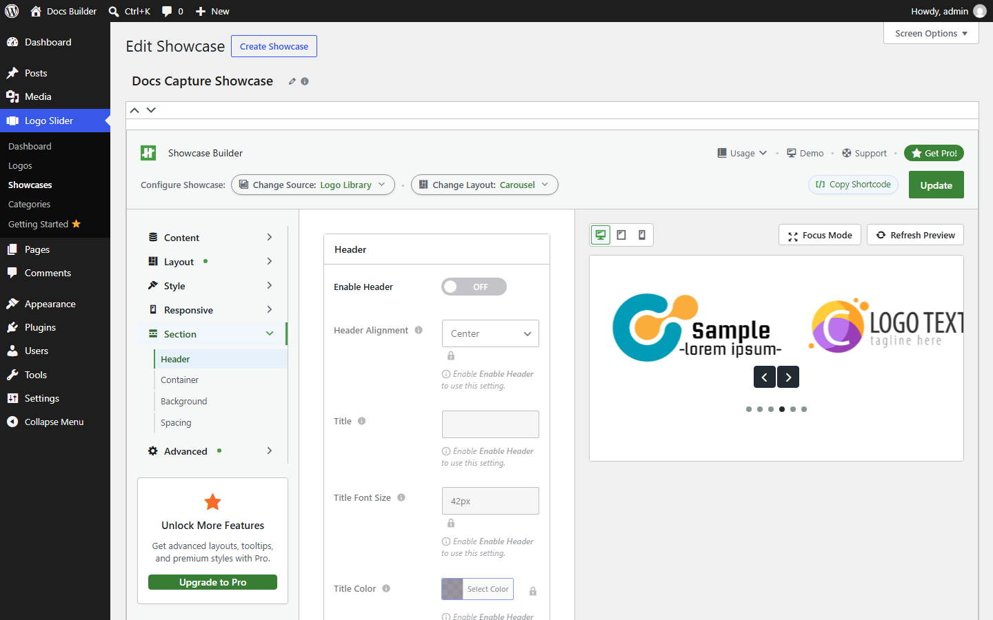
Sub-navigation: Header, Container, Background, Spacing. Shown: Header.
Legend
- Enable Header — Free, off by default.
- Header Alignment, Title, Title Font Size, Title Color — all shown greyed out with 🔒 in this screenshot because Enable Header is off; Alignment, Title Font Size, and Title Color are Pro even once enabled, while the Title text field itself is Free.
Container (width/container setting) and the basic Background color are Free; Background image is Pro. Section margin is Free; section padding is Pro. See Settings Reference for the exact field list.
Advanced tab
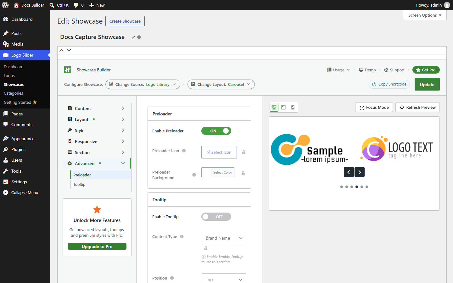
Sub-navigation: Preloader, Tooltip.
Legend
- Enable Preloader — Free, on by default in this screenshot.
- Preloader Icon and Preloader Background 🔒 — Pro (custom branding of the preloader).
- Enable Tooltip — Free, off by default.
- Content Type 🔒 — Pro, and (like Header Alignment above) greyed out until Enable Tooltip is on.
Tooltip's basic on/off, position, and min/max width are Free; everything about its appearance and trigger behavior (animation, timing, colors, border, arrow) is Pro.